


Photo gallery
More visuals from this story
Additional collector, city, and tournament visuals connected to this launch story.


Campaign pages usually fail because they spend all their energy trying to sound important and almost none of it helping the user decide where to go next. They promise transformatio...
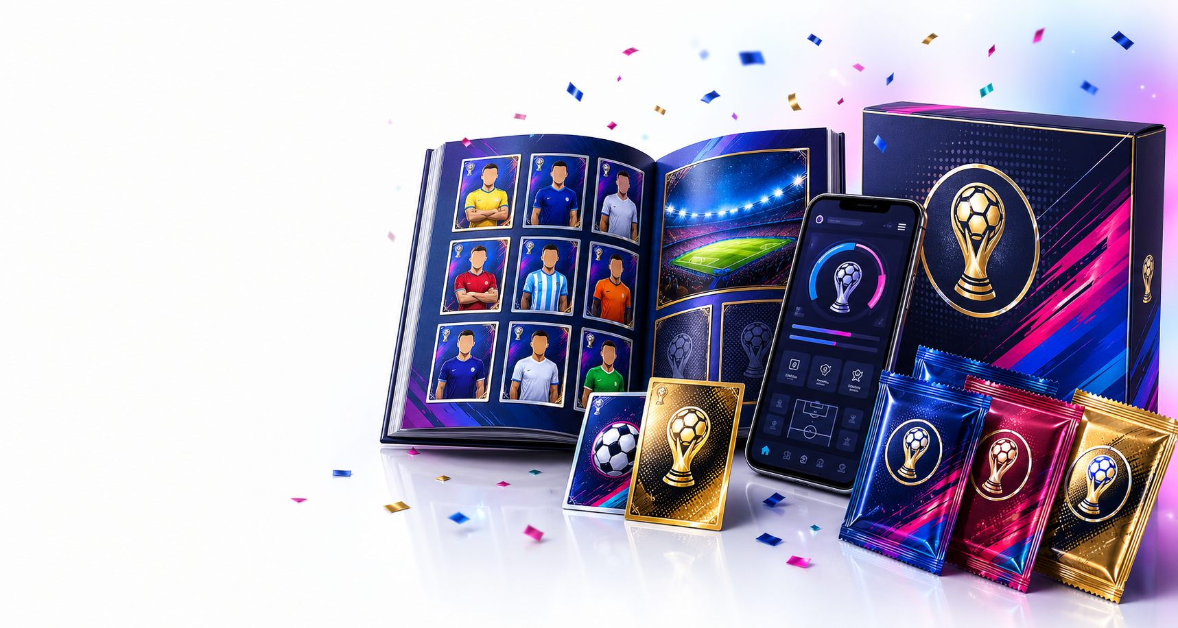
Additional collector, city, and tournament visuals connected to this launch story.
Official YouTube videos connected to the World Cup 26 build-up, host-city welcome, and tournament launch atmosphere.
Campaign pages usually fail because they spend all their energy trying to sound important and almost none of it helping the user decide where to go next. They promise transformation, stack a few glossy blocks, and then leave the visitor with the same basic question they had before: what do I do now? That kind of page can attract a click, but it rarely carries real momentum into the product. We wanted a very different outcome with the new campaign pages. These pages are meant to work, not pose. They frame the story of the rollout, but they also direct attention toward the right destination while the visitor is still interested. In other words, they act as launch navigation. They turn curiosity into movement. That is a much more demanding job than generic marketing, but it is also the only version of campaign content that genuinely supports product growth instead of just decorating it from a distance.
The architecture behind this matters a lot. A campaign page should not behave like an endpoint. It should behave like the first clear move in a sequence. That is why the rollout now connects the campaign layer to the Collector Hub, the Live Hub, and the City Hub instead of leaving those pages to stand alone. Each page now has a job, and the jobs complement each other. One page introduces the story. Another page turns that story into a collector workflow. Another keeps energy alive through live context. Another expands the experience with richer topical or location driven entry points. When those jobs line up well, the site stops feeling like a loose collection of pages and starts feeling like a guided system. That is the difference visitors can feel even if they never name it directly, because the journey simply makes more sense from first click to deeper exploration.
The blog improvements matter here too, because the blog is now functioning as editorial support for the campaign system rather than sitting off to the side as a generic archive. Each post explains a real feature, a real hub, or a real user side change in language that people can understand quickly. That means the campaign page can lead into stories that deepen trust instead of forcing the visitor to rely on headline level marketing alone. This is important because good launch content is layered. Some people want the quick pitch. Some want the product logic. Some want proof that the new features were designed with care. By giving the campaign pages stronger follow through into the blog, we are covering all of those decision styles. A visitor can move from overview to explanation without the tone breaking, and that continuity makes the whole launch feel more deliberate and much more credible than a simple landing page ever could on its own.
There is also a voice element to all of this that I did not want to compromise. Pages like these should feel confident and polished, but they should never sound inflated. The strongest product marketing voices are usually the ones that feel natural, precise, and grounded in what the user actually gains. That is the direction we pushed here. Instead of vague claims, the new pages speak in a way that reflects the product more honestly. They explain how multilanguage removes friction, how album control creates order, how trade supports progress, and how live hubs keep collector energy active. That tone gives the launch a more professional feel because it replaces filler with clarity. Visitors do not have to decode the promise. They can see the path, understand the benefit, and move without feeling manipulated. That is the kind of voice that helps a growing platform earn trust at scale rather than just collecting empty impressions.
When campaign pages, hub pages, blog stories, and user facing features all reinforce one another, something subtle but powerful happens: the site starts acting like one coordinated product instead of a set of independently updated sections. That coordination is what we were really building today. The visual polish matters, the new blog matters, the admin side publication controls matter, and the stronger navigation matters, but all of them are part of a larger shift toward coherence. Users should not need to hunt for the right page or guess which section explains the latest release. The product should guide them with confidence. That is what these new campaign paths are doing now. They are making the launch easier to understand, easier to explore, and easier to believe in. For a platform trying to grow both usage and trust, that is not a cosmetic win. It is a structural one that improves how every future release will be discovered and understood.
Lorem, ipsum dolor sit amet consectetur adipisicing elit. Exercitationem, facere nesciunt doloremque nobis debitis sint?