

Photo gallery
More visuals from this story
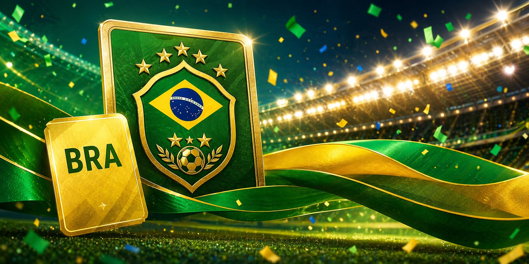
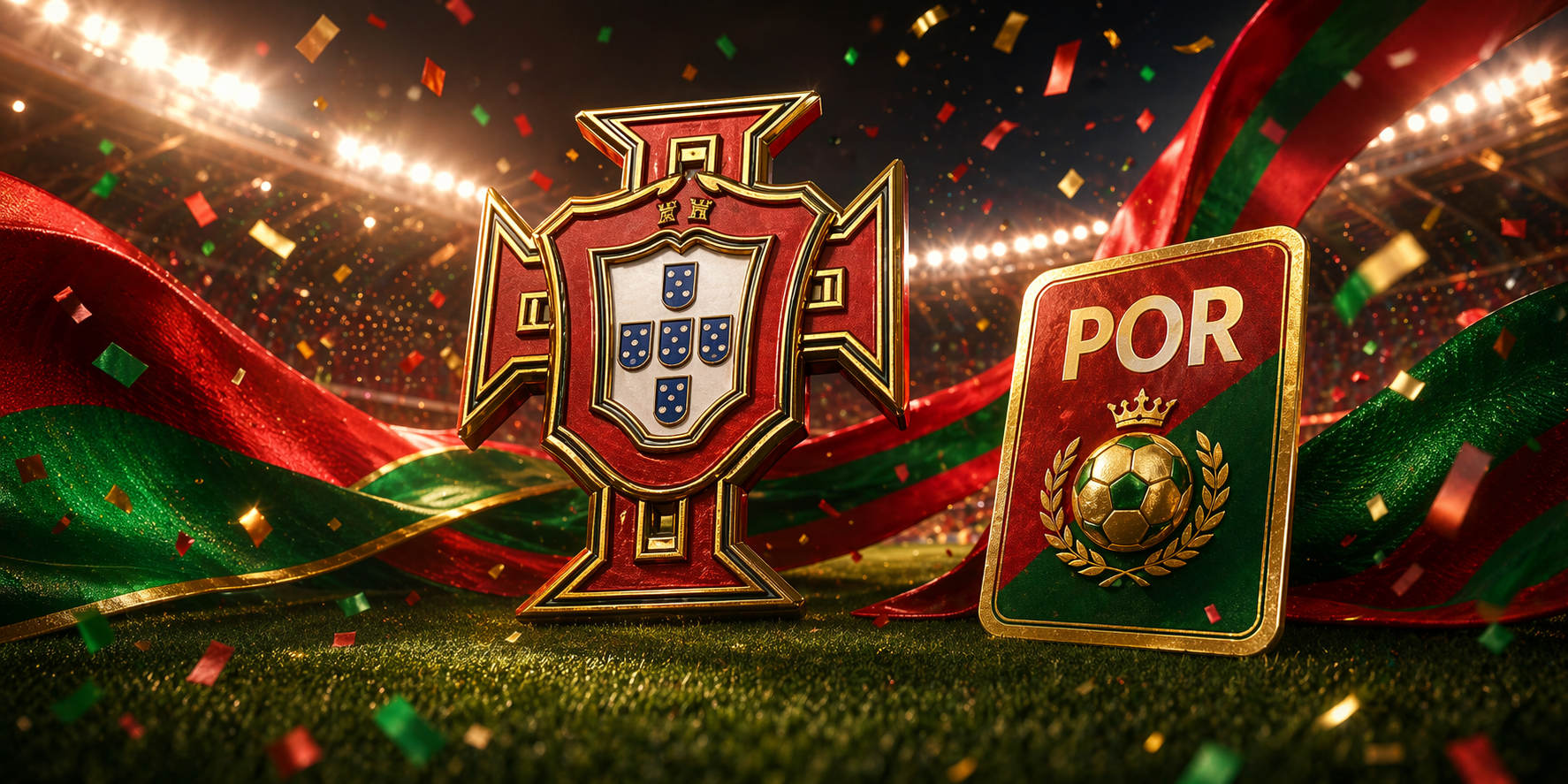
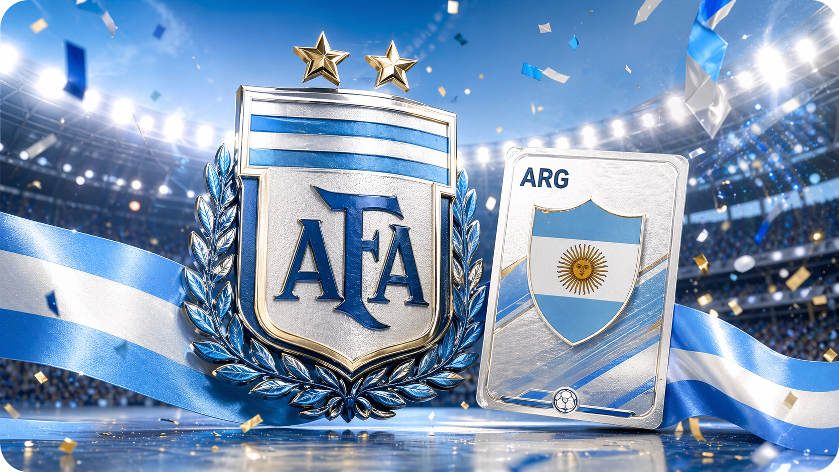
Additional collector, city, and tournament visuals connected to this launch story.

Language friction is one of the easiest ways to lose a user before the product has a real chance to prove itself. It rarely looks dramatic from the outside. It is usually a quieter...
Additional collector, city, and tournament visuals connected to this launch story.
Language friction is one of the easiest ways to lose a user before the product has a real chance to prove itself. It rarely looks dramatic from the outside. It is usually a quieter failure: a menu label that feels uncertain, a page that takes too much effort to decode, a flow that sounds slightly off, or a call to action that leaves the visitor guessing instead of moving. Those moments add up fast, especially in a collector experience where trust and rhythm matter. The new multilanguage rollout was built to remove that hidden tax. We wanted visitors to understand the site without translating it in their heads, and we wanted that clarity to show up everywhere that matters: navigation, hub pages, campaign entry points, blog content, and the product journeys that support actual collecting behavior. When language starts helping instead of slowing people down, the entire experience becomes lighter and far more welcoming from the very first screen.
What makes this important is that multilanguage is not a cosmetic layer sitting on top of the real product. It changes how approachable the product feels from the first second. A collector deciding whether to stay on a page is not making that decision based only on features. They are also reading for confidence. They are asking, often unconsciously, whether the site seems clear, whether it feels built for people like them, and whether the next step looks understandable enough to be worth taking. That is why we treated this as infrastructure, not decoration. The improved language support helps the site feel less intimidating for first time visitors and more trustworthy for returning users. It also strengthens the new header, the updated blog structure, and the campaign pages because everything now speaks in a way that is easier to follow. That kind of consistency is what turns translation from a checkbox into a real product advantage that users can actually feel.
There is also a tone question here, and tone matters more than most teams admit. A multilingual experience can still feel distant if the words are technically correct but emotionally flat or awkward. We wanted to avoid that. The goal was not only to present alternate language versions, but to preserve the natural, confident voice of the platform so the site still feels like it knows what it is doing. That matters on pages like the Collector Hub, where users need more than labels. They need a sense of guidance. They need to feel that the page is helping them think clearly, not just relabeling buttons. The same is true across launch content and marketing pages. If a visitor arrives through the campaign journey and the language feels uncertain, the product starts losing authority immediately. Better phrasing, better structure, and cleaner localization restore that authority without making the experience feel robotic or over translated.
The global collector opportunity is also bigger than one region or one language preference, and the platform should reflect that reality. Collectors discover teams, players, and tournament moments from all over the world, and they often bring that global context directly into how they buy, trade, and complete albums. A site that only feels easy in one language is automatically leaving growth on the table and creating unnecessary friction in trade and community interactions. By improving the language experience, we are making it easier for more people to understand pages, move through flows, and stay active long enough to see the real value of features like album control, trade, and live hubs. That has a direct effect on onboarding, but it also helps with retention. People return to environments that feel comfortable to think inside. That is exactly what better multilingual support creates: a platform that feels easier to think inside no matter where the visitor is arriving from.
The strongest part of this release is that it supports both product quality and growth quality at the same time. It makes the current experience better for users who are already here, and it makes future acquisition more realistic because the site can now meet more visitors where they are. That is why I see this as one of the most commercially important upgrades in the whole rollout. It improves first impressions, reduces confusion in key journeys, strengthens the blog and campaign layers, and gives every new hub page a better chance to convert attention into action. Good platforms do not grow simply by reaching more people. They grow by removing friction at the exact moments when people are deciding whether to trust, explore, and return. Multilanguage support is doing that work now. It is making the platform easier to enter, easier to understand, and much easier to believe in as a serious home for collectors.
Lorem, ipsum dolor sit amet consectetur adipisicing elit. Exercitationem, facere nesciunt doloremque nobis debitis sint?